At Populate I had the pleasure of working on decidim.barcelona, Barcelona City Council’s platform for participatory democracy.
This open-source tool —used by more than 60 organizations, including the city of Helsinki and Ciudad de Mexico—, is a digital space where citizens can debate, gather proposals, and vote to improve their life and that of their neighbors.
The mission
My main task during the six months I was involved in the project was to refine and improve existing participatory modules and processes, and design new ones. I led the design and worked in collaboration with decidim’s team and several external technology providers.
Since the project is open-source, many of the design decisions are public and accessible in GitHub. Here are some of my contributions.
Challenges
There were two main challenges in this project:
- Getting a clear understanding of the city’s participatory processes: each process had its own timeline, rules, and ways of working, and I needed to grasp these details to design effective solutions.
- Designing flexible and reusable solutions: it was very important to develop solutions that could work for the specific Barcelona use case, while, at the same time, remaining valid and adding value to the general open-source project.
The cards
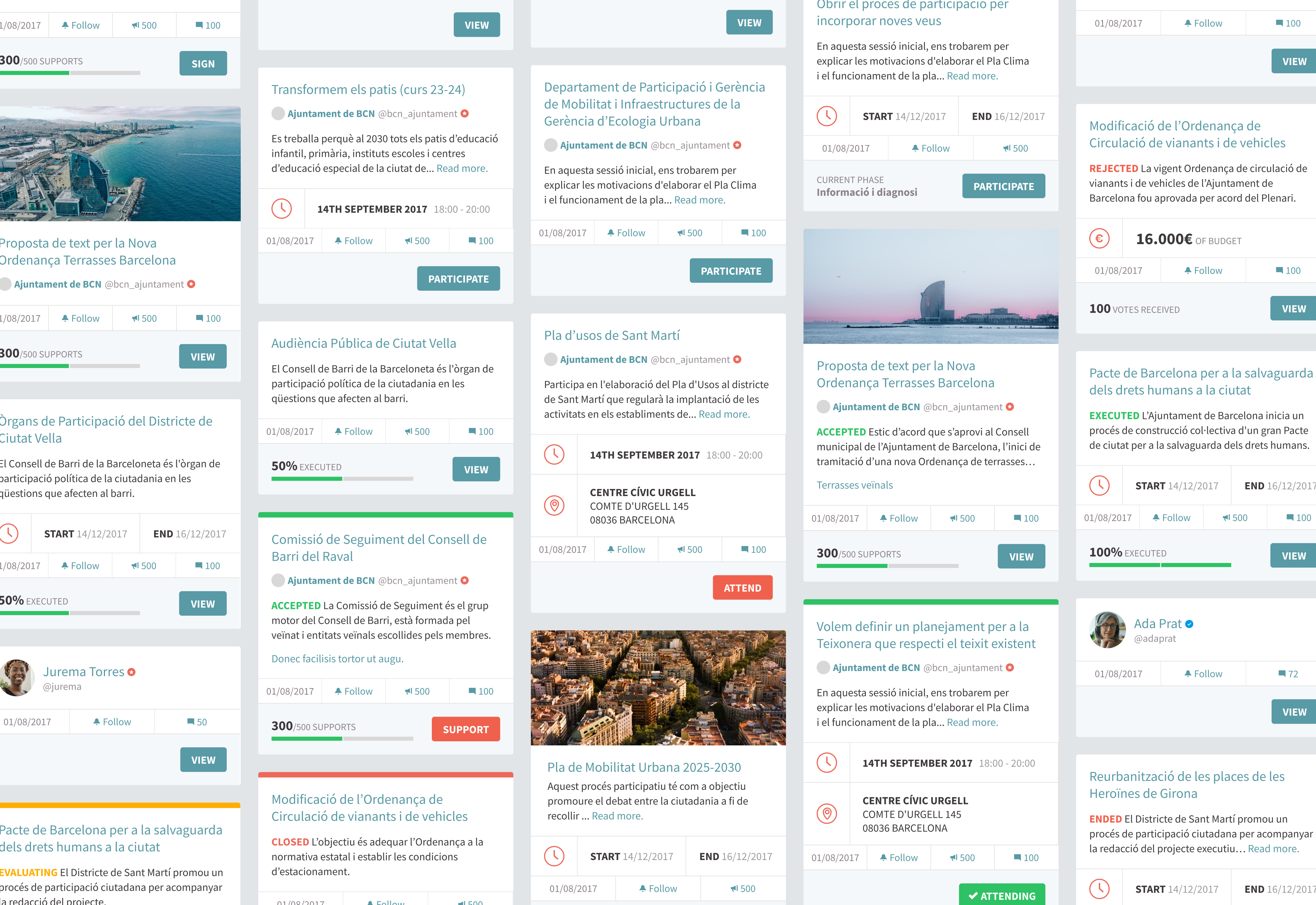
Although the project involved the redesign of several modules, one of the most significant challenges I encountered during the project was designing a cohesive system for the diverse range of cards used throughout the platform. These cards served as small, informational components that encapsulated details about past and future meetings, deliberation outcomes, polls, and other key elements. As the fundamental building blocks of the platform, creating a unified card system was crucial for maintainability and scalability.
Prior to my involvement, the existing card set was limited and had been developed in an ad-hoc manner without comprehensive planning. While this approach was adequate for the initial small number of modules, it became evident that a more systematic approach was necessary as the platform began introducing new avenues for participation.
My approach
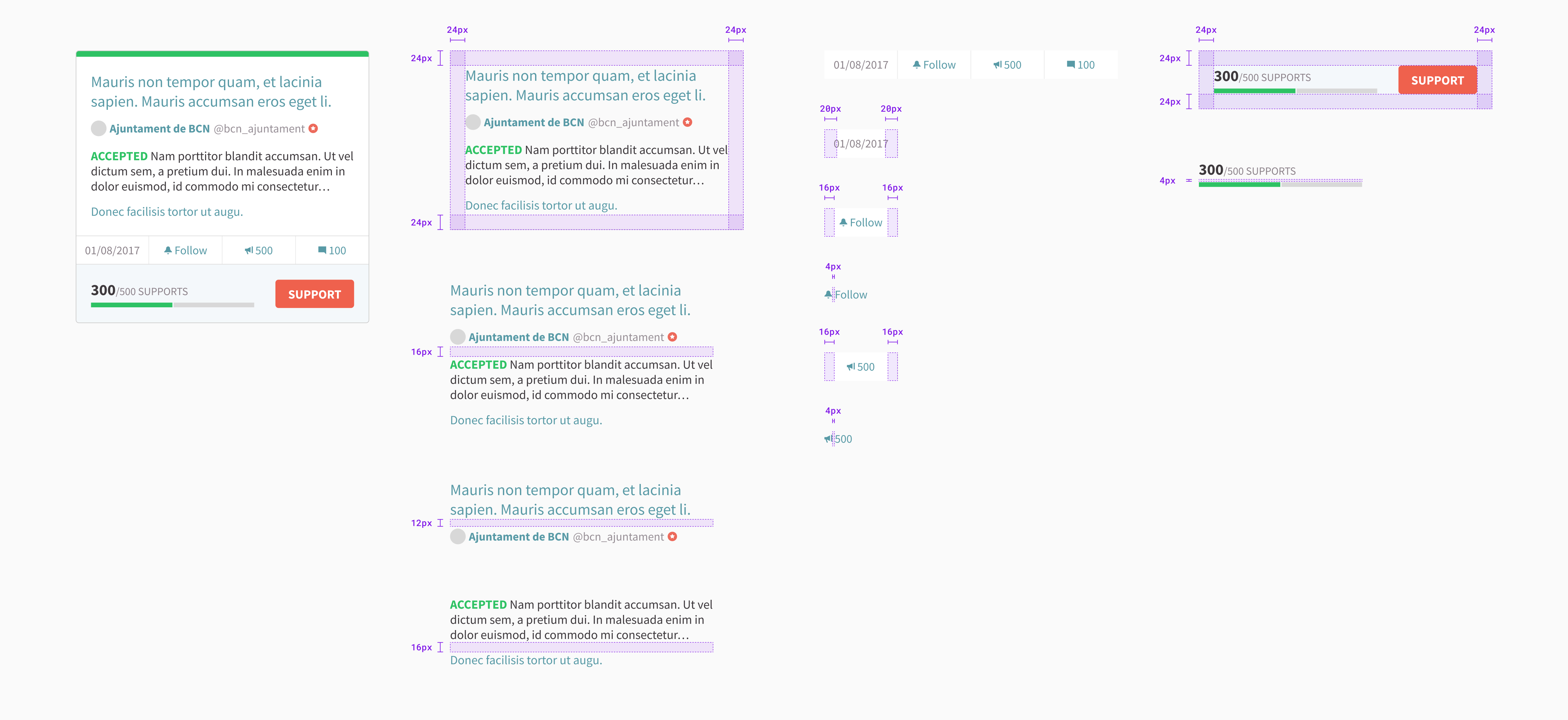
To address this challenge, I collaborated closely with the different teams to analyze the current card usage, identify common patterns, and establish a set of design principles. By defining clear guidelines for card layout, content hierarchy, and visual consistency, we were able to create a flexible and extensible card system that could accommodate existing and future requirements.
The resulting card system provided a more coherent and intuitive interface but also streamlined the development process for the team.
As part of my role, I was tasked with designing cards for more than seven distinct modules within the platform, including proposals, initiatives, consultations, meetings, debates, sortitions, accountabilities, and budgets.
Each module had its own unique requirements and needed to display slightly different types of information, which posed a significant challenge in creating a cohesive user experience.
Recognizing the importance of consistency and simplicity for the platform’s users, I set out to develop a unified set of cards that could be applied across all modules. By identifying common elements and defining a standardized layout, I aimed to create a card system that would not only streamline the implementation process but also facilitate future extensions and improvements.
Designing the card system
To achieve this goal, I conducted a thorough analysis of each module’s specific needs and collaborated closely with the development team to understand the technical constraints and possibilities. Through an iterative design process, I created a flexible card template that could accommodate the varying information requirements while maintaining a consistent visual language and user experience.
The resulting unified card system brought numerous benefits to the platform. From a development perspective, it simplified the implementation process and reduced the need for custom code for each module. This, in turn, made the platform more maintainable and allowed for easier integration of new features and modules in the future.
More importantly, the consistent card design greatly enhanced the user experience for Barcelona’s citizens. By presenting information in a familiar and predictable format across all modules, users could more easily navigate the platform, find the information they needed, and engage with the various participatory processes.
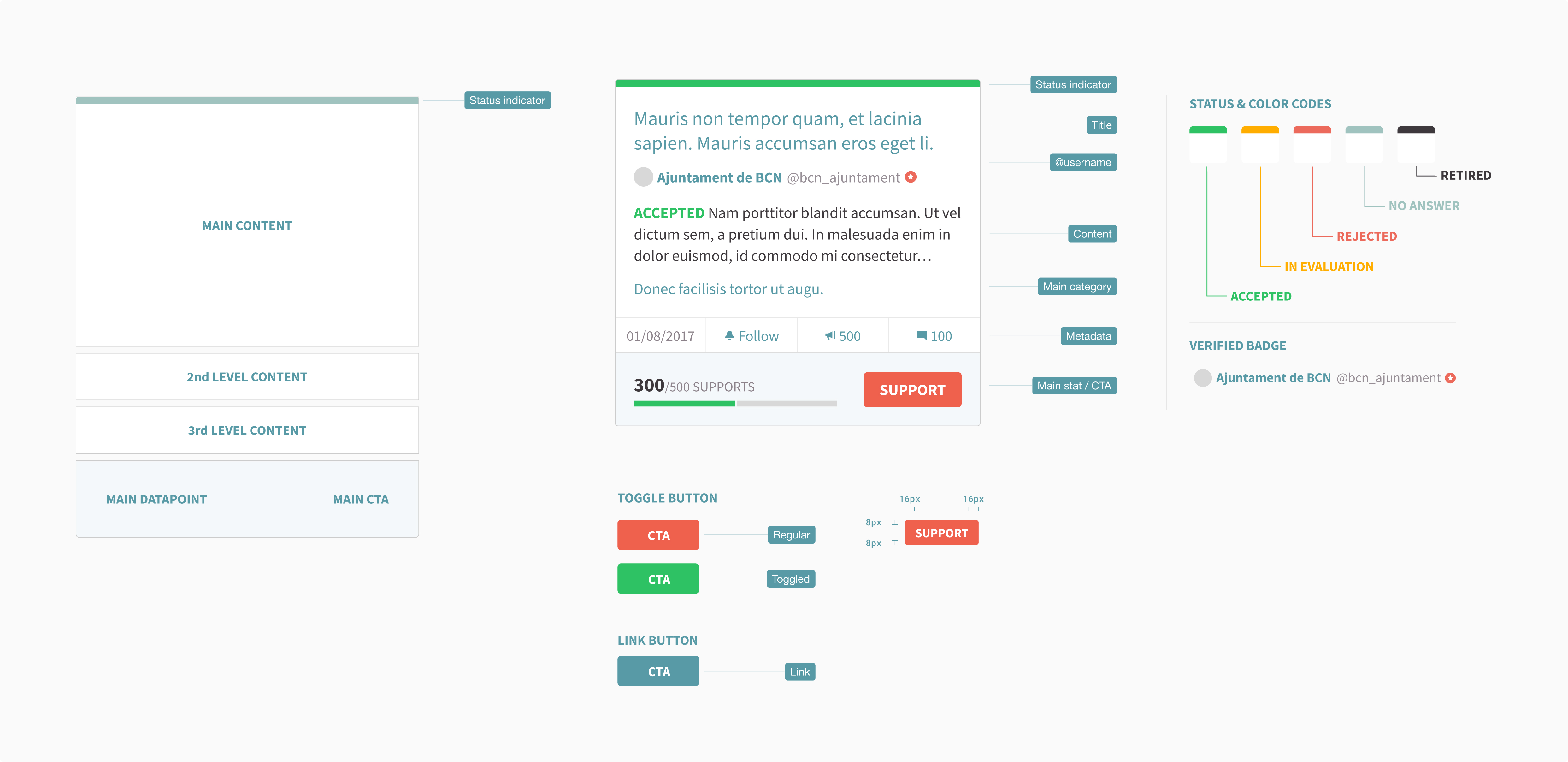
In designing the new card system, I placed great emphasis on creating a clear and intuitive information hierarchy. By strategically arranging the content within each card, I aimed to guide users’ attention to the most critical elements and streamline their interaction with the platform.
The card hierarchy
To enhance usability, I emphasized creating a clear and intuitive information hierarchy:
- Top section designed to display the most critical information—such as the title, key dates, and a brief summary—so users could quickly determine the relevance of each card at a glance.
- Middle section: provided more detailed and contextual information, presented in a scannable format with concise text and visual aids.
- Bottom section: reserved for actionable elements like buttons or links, guiding users to engage further after absorbing the necessary information.
This structure ensured flexibility and scalability. As the platform grew, new types of cards could be easily integrated using this modular approach.
Takeaways
Working on this project was immensely rewarding for several reasons. Its open-source and participatory nature aligned perfectly with my values. Knowing that Barcelona’s citizens actively used the platform made the work feel impactful and relevant.
On a personal level, this was a milestone in my growth as a designer. It was my second major design project and provided an invaluable opportunity to expand my skills, test my abilities, and refine my design approach.
Upon reflection, however, there are areas I would approach differently:
- Given the six-month duration of my involvement and the need to juggle other Populate projects simultaneously, I feel I could have made an even greater contribution with more dedicated focus.
- I also missed the opportunity to gather user feedback and iteratively improve the platform. Conducting user testing and releasing incremental updates based on their responses could have led to a more refined and user-centric final product.
Despite these limitations, collaborating with decidim.barcelona and the City Council was an absolute pleasure. Their talent, kindness, and openness to discussing ideas made the experience both enjoyable and memorable.