Reale Seguros, a Spanish insurance provider, approached NTT Data with the challenge of designing a new product for their insurance portfolio: a fully digital service that could be bought by the tap of a button.
Context
Reale had four reasons to launch this new product:
- They were interested in addressing changes in customer consumption habits that weren’t being met by their business.
- They wanted to catch up with the rapid transformation and expansion of the insurance space.
- They wanted to diversify its customer profile, targeting a younger, more urban, and more digital demographic.
- They wanted to adapt to the current COVID-19 context in which digital sales were more relevant than before.
With that in mind, they identified a big opportunity in the insurance of medium and high-end sports equipment, electronic devices, and personal belongings (for both B2C and B2B2C).
To solve these challenges, we worked together to develop and validate a business model for this new service, and create an MVP in the form of an app.
The team
The internal project team consisted of 10 people:
- A Service Designer
- A Product Designer (myself)
- A UI/UX Designer
- A Brand Designer
- A Researcher
- Two Process and Operations Insurance Consultants
- Two Actuarial Directors
- And a Product Owner
As the Product Designer I was in charge of the definition of the application flows, the visual design, the implementation of the brand guidelines, and the development of the interactive prototypes.
The catch
Because of time constraints, we had to work in the brand design at the same time we developed the visual language of the app. That overlap meant that some of the design decisions could be revoked by the client (or the Brand Designer) at any point in the design phase.
This made the initial tasks of the design process uncertain. We solved this issue with lots of communication and constant feedback loops between the brand and visual teams. Lucky for us, except for the substitution of the main typography and minor color adjustments, the changes didn’t really impact the design of the app.
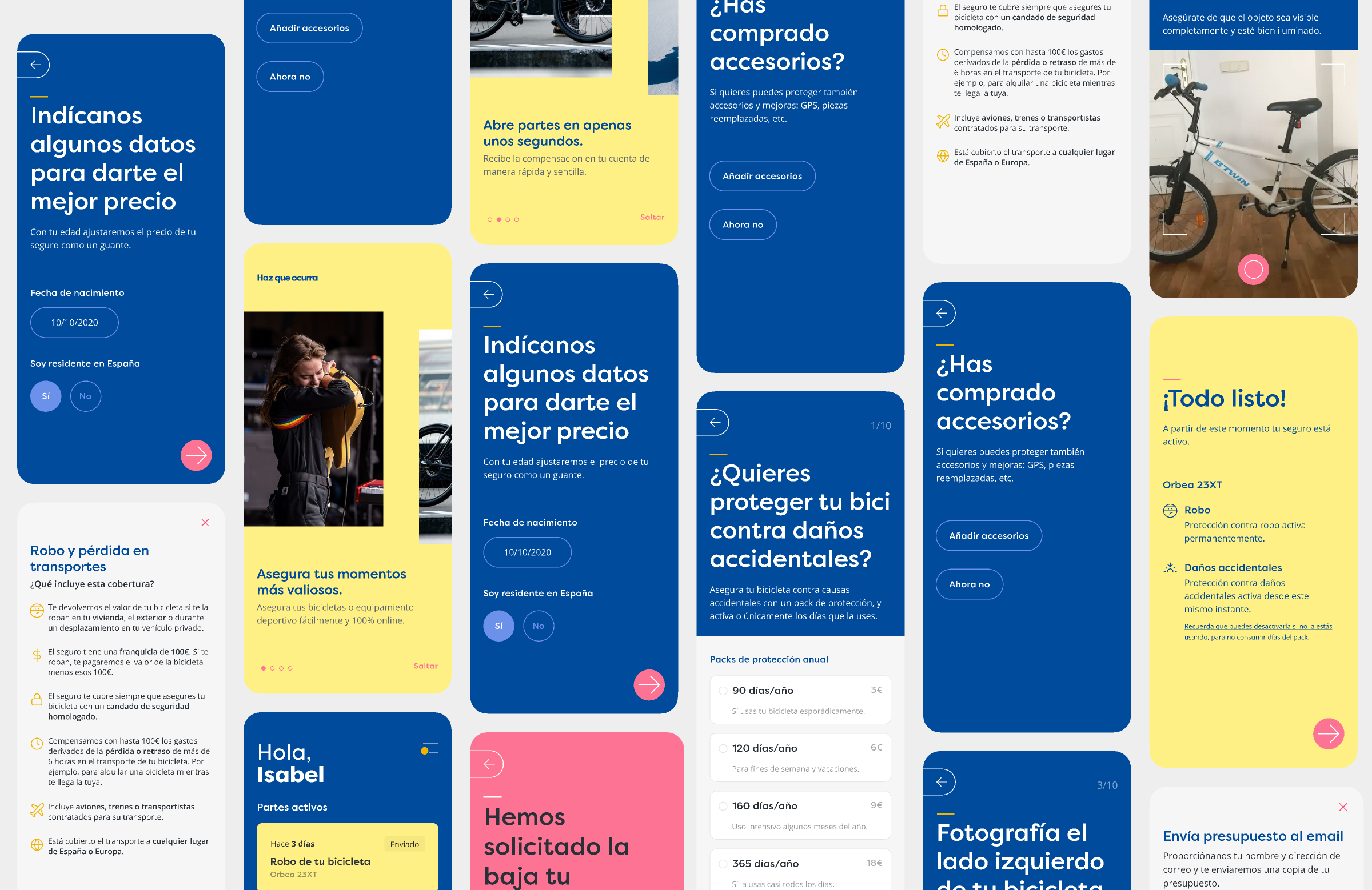
Onboarding
One of the biggest challenges in this project was to create a simple onboarding process that didn’t impose a lot of friction on the users.
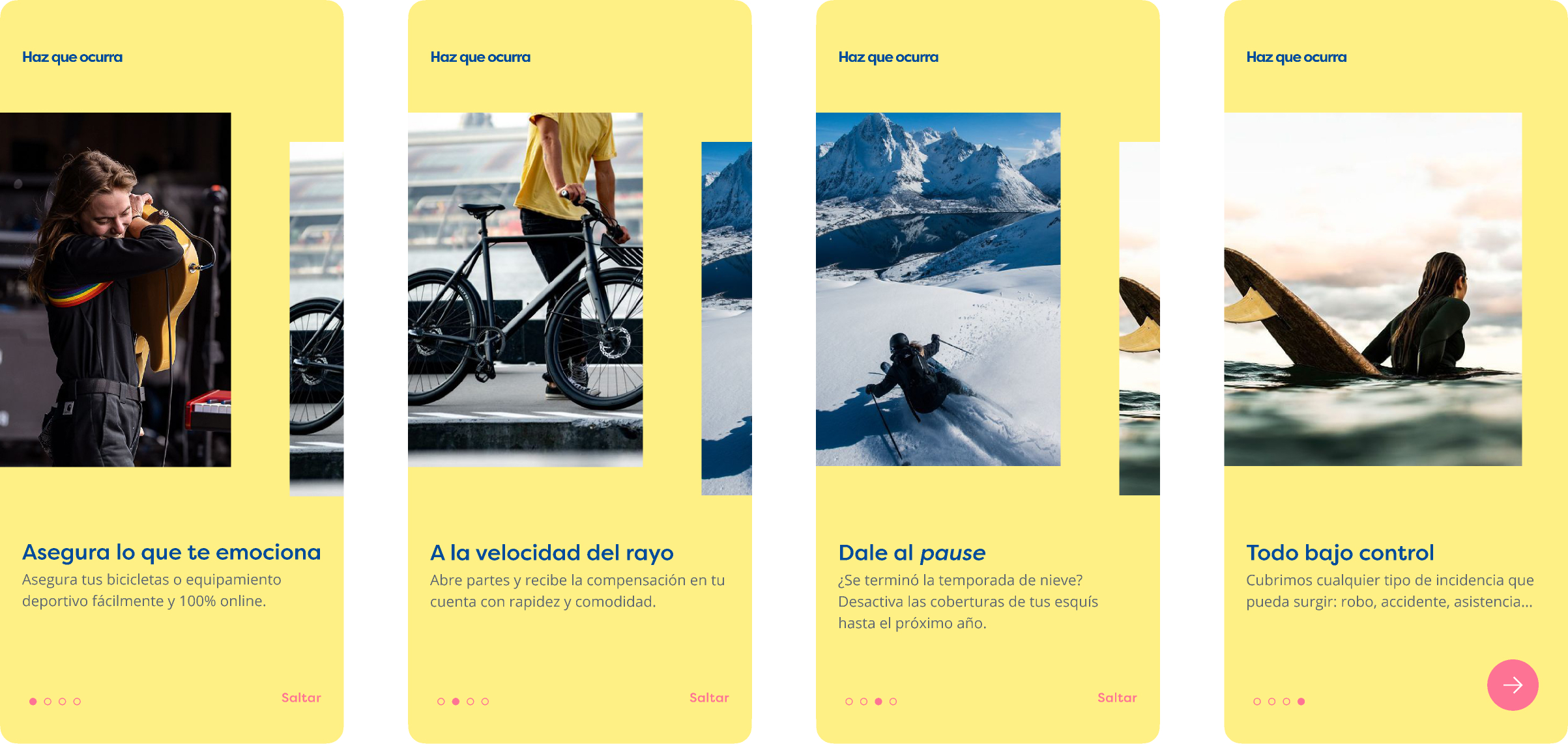
The onboarding flow for this app is composed of three different phases:
- A slideshow that showcases the benefits of the product (like being able to buy and manage the product just using the app, or the ability to enable or disable the insurance coverages).
- The quote generation process where users get an estimation of the insurance.
- The account creation process.
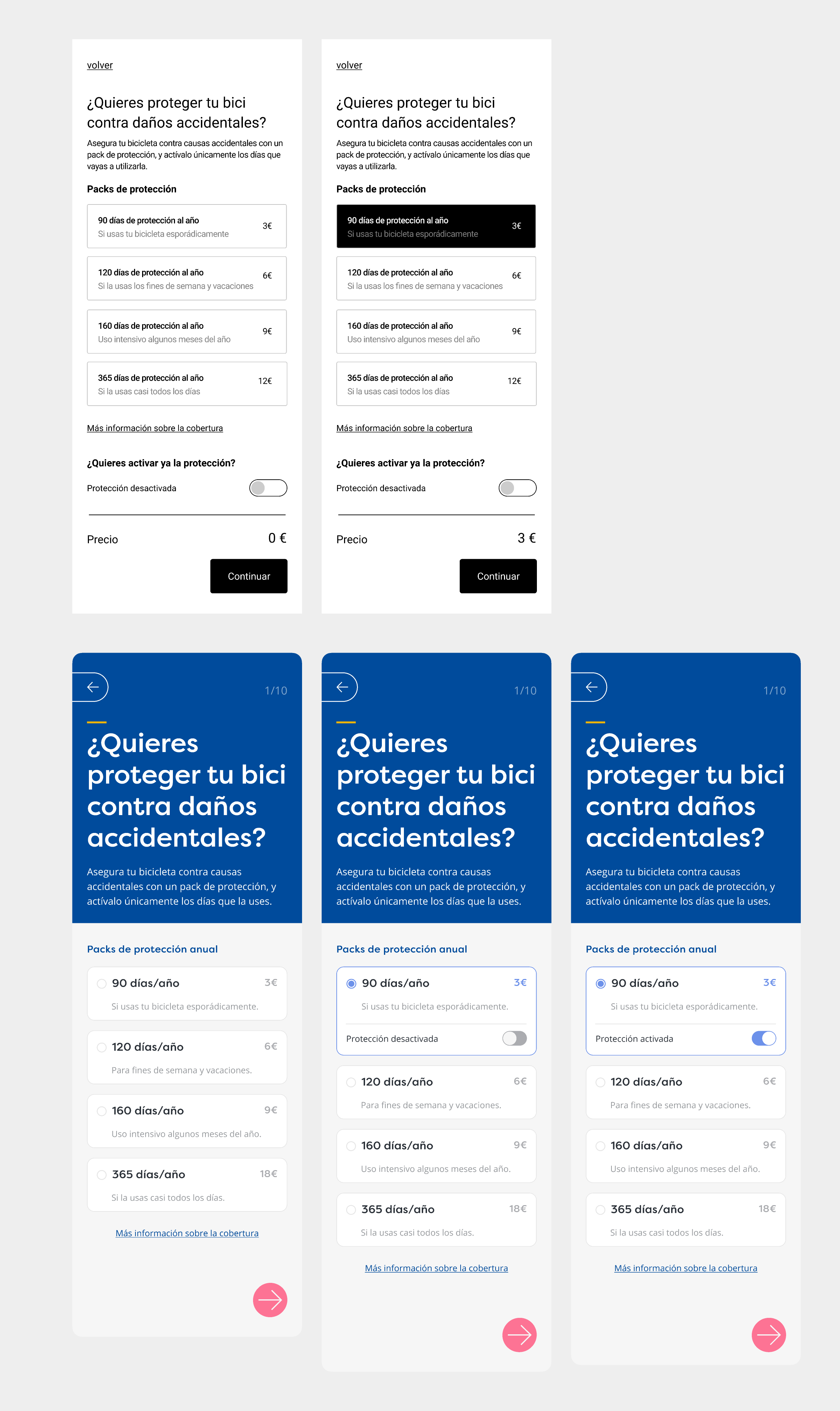
In order to mitigate the risk of presenting a complex or boring process to the user that could make them leave the app, I decided to slice the long, mandatory questionnaires in little units with one main task that was simple to complete with a phone.
Another important aspect of this flow was to allow users to submit the objects’ invoices at any moment of the process, and not just during the onboarding flow. This was important if, for instance, the client initiated the process while commuting, and didn’t have all the documents at hand.
The flow I designed also supported different kinds of products with special requirements while fundamentally working in the same way.
For instance, to insure golf equipment the client would need to detail every single golf club (brand and model) they want to protect, while for other objects (like mountain bikes) the process is much more straightforward.
Takeaways
One of my favorite aspects of this project was familiarizing myself with the client’s problem domain. Even with a topic as dry as insurance policies, there are always interesting details to learn. In this case, I gained knowledge about insurance fraud and how insurers estimate risk.
However, the project had its challenges. The planning issues I mentioned earlier required us to start the visual design before defining the brand’s mission and vision. When designing a product without a clear direction, certain design decisions become more difficult to defend and justify.